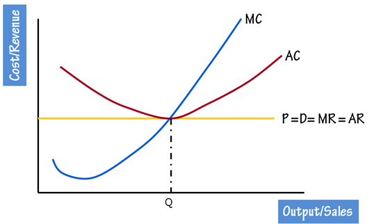
Drawing Cost/Revenue curves and Market structure curves is usually a confusing affair for students. Just follow these 4 steps and you will never go wrong with your diagrams. There is a detailed PowerPoint presentation on dineshbakshi.com which illustrates all these steps. Click here to goto to the Presentation page
Congratulations!! You have completed the diagram.
Step 1
Draw a Revenue Curve i.e. MR & AR curvesStep 2
Now place revenue curves i.e. AC and MC curves.
- If there is abnormal profit the AC curve will be below the AR curve.
- If there is loss then the AC curve will be above the AR curve.
- If the firm is having normal profit then the AC curve touches the AR curve.
Step 3
Now, identify the output level of the firm. It is always be the profit maximisation level, i.e. the point where the MC cuts the MR.Step 4
At the profit maximisation level, identify the cost on AC curve and the revenue at AR curve. The difference will give to abnormal profit and loss accordingly.Congratulations!! You have completed the diagram.
